The problem
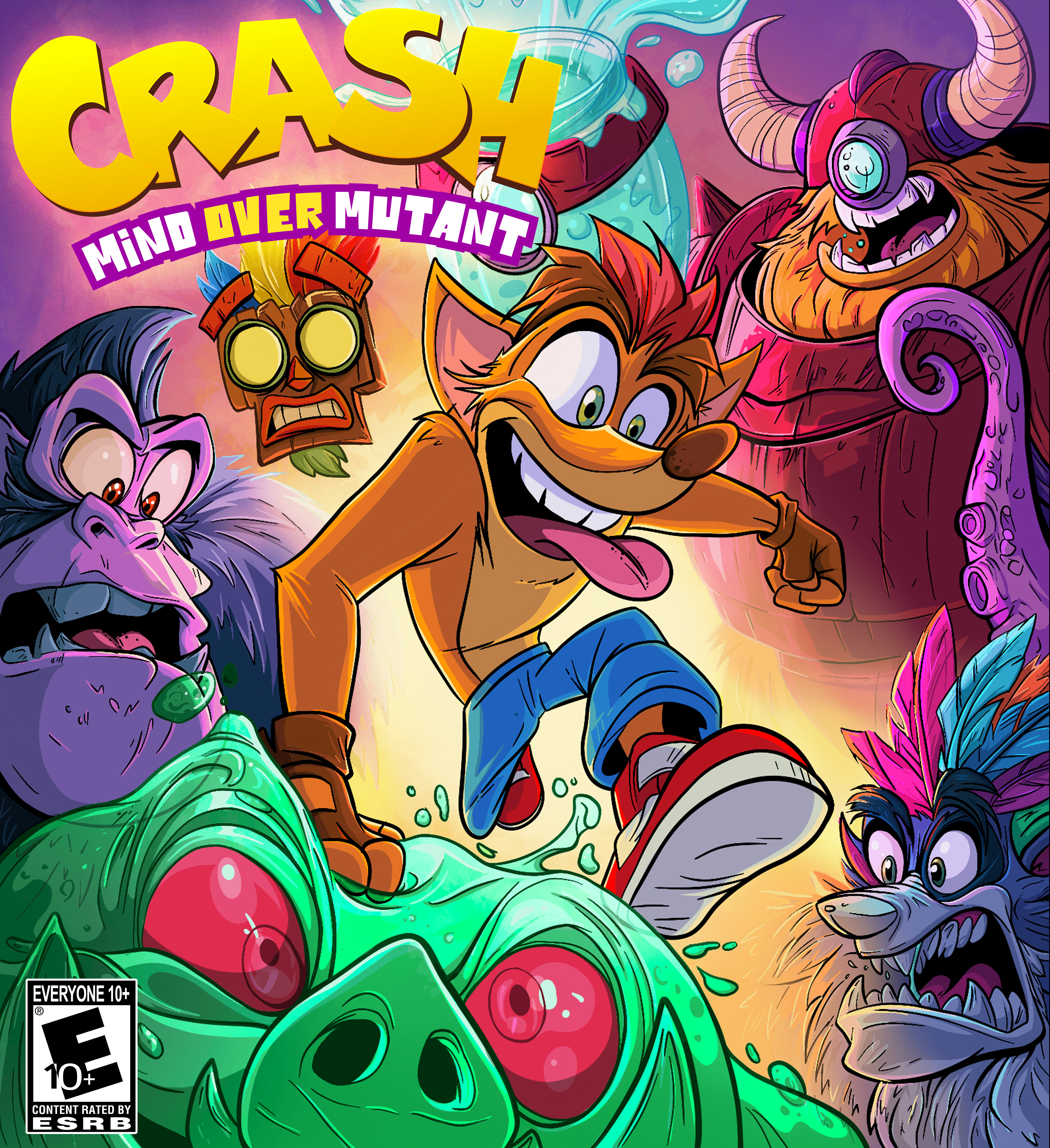
The original Crash Bandicoot: Mind Over Mutant designs are textbook examples of mid-2000s "edgy" character design. It's dark, ominous, and devoid of comedic levity. The focus is on tension and fear, not chaotic fun. In retrospect, it's lost the fun of what makes Crash the character he is.
The objective
I recently felt the urge to give myself a creative shock to the system and revisit some of my past favorite projects. This project immediately jumped out as a candidate for an update. I re-examined what the key art and branding for this could be if this game were to be re-made today. I went back to Crash's roots of being an exaggerated, animated, lovable goof and took that idea literally. What if the game leaned into the chaotic, cartoonish design?
The result
A completely fresh and fantastic feeling Crash cover design that literally jumps out at viewers and screams fun. It brings back the bold Crash attitude in classic comic book fashion clearly telling a story of antics and comedic fun. The bold, saturated colors drip with energy cutting through the noise of everything on the shelf around it.