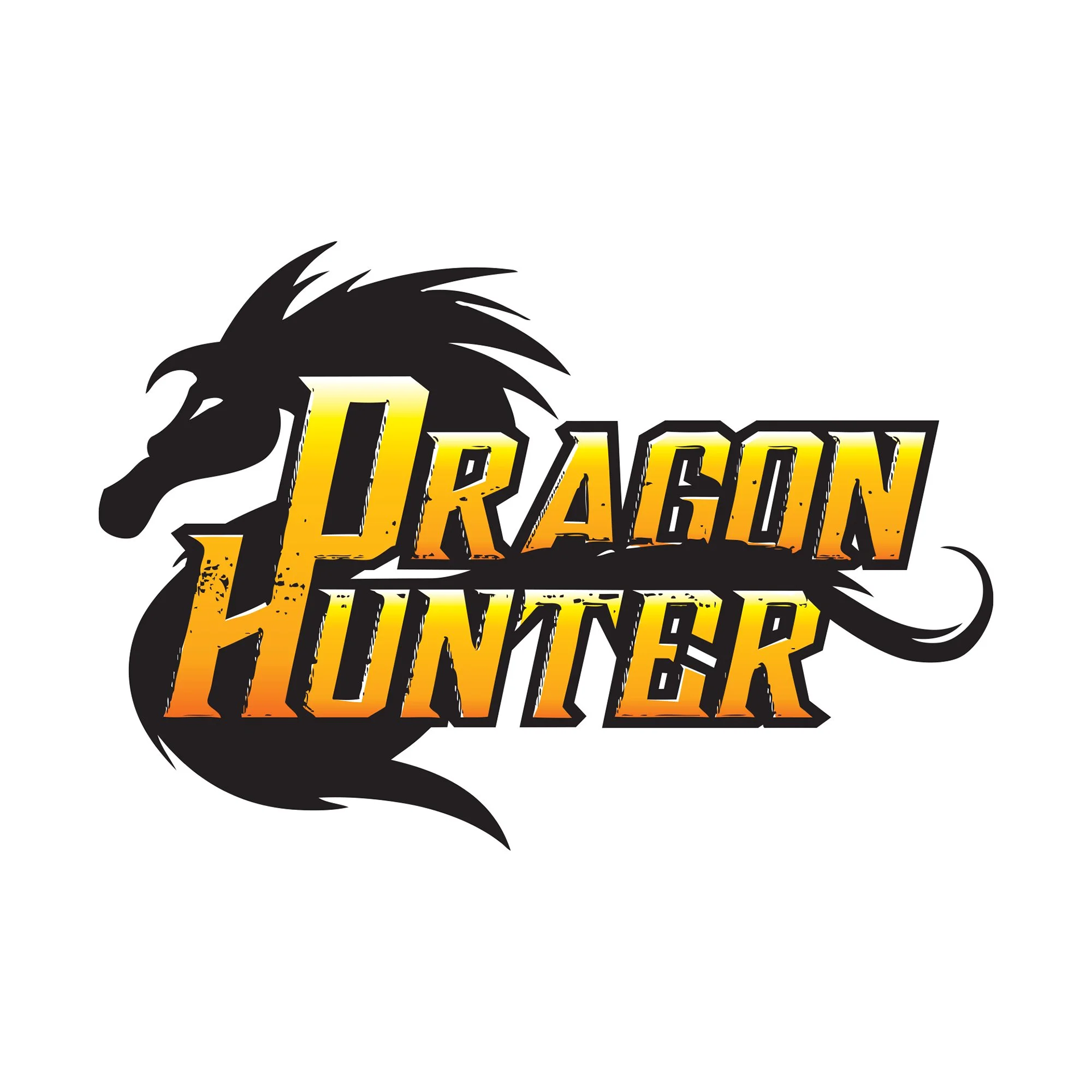
The problem
When I took on the logo and branding presentation for Dragon Hunter, the title needed a visual identity as strong and distinctive as its fantasy world. Originally published by TOKYOPOP in the mid‑2000s, the series operated in a booming manga market where TOKYOPOP was rapidly expanding. The challenge: design branding that could hold its own in a crowded category and reflect the high‑stakes, heroic tone of dragon‑hunters in action.
The objective
My goal was to create a logo and packaging design system that captured motion, power and mythic energy—while aligning with a publisher riding strong growth (TOKYOPOP was distributing thousands of titles across thousands of stores at the time). The visual identity needed to feel bold, readable at small sizes, and compelling across physical and digital platforms.
The result
The redesigned Dragon Hunter identity delivered exactly that: a logo that conveys epic scale and adventure, a visual tone that matched the story’s world, and design elements that elevated the title in TOKYOPOP’s catalog at a time when the publisher was at the forefront of the U.S. manga market. While specific sales numbers aren’t available for this title, the timing and quality of the branding aligned with a period of real momentum for the publisher and helped position the book as a standout.