The problem
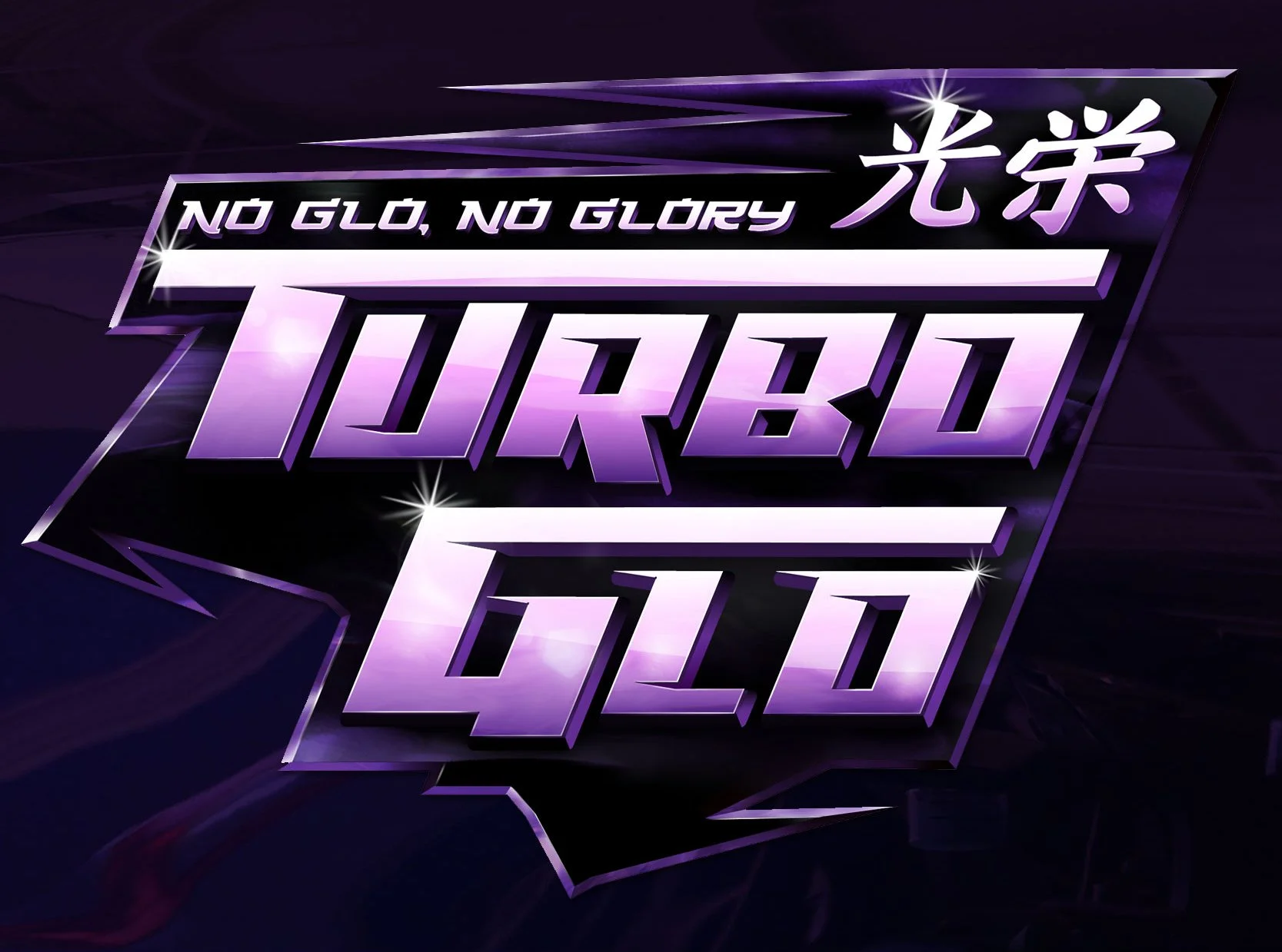
While at Hot Wheels, I took on the global packaging portfolio and identified the Turbo Glo line as a major opportunity: kids loved racing cars, glow-effects and high-impact visuals, but the packaging and branding lacked the “wow” factor to elevate the line above mass shelf clutter.
The objective
My goal was to bring larger-than-life branding to Turbo Glo — bold, visually striking packaging with glow-in-the-dark elements and dynamic graphics that matched the performance-play promise. I developed a consistent visual system across dozens of models and hundreds of unique packages, making each piece feel premium, collectible and instantly exciting for the youthful audience.
The result
The refreshed Turbo Glo line successfully positioned itself as a standout in the Hot Wheels portfolio — kids were drawn in by the glow-effects and shelf presence, packaging became memorable, and the line’s identity gained recognition among fans and collectors with references in vintage and collector forums highlighting the “Turbo Glo” designation in product listings.