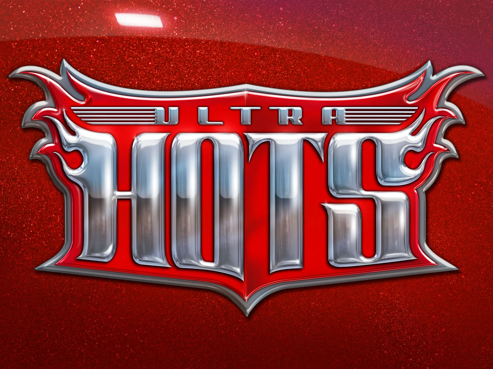
The problem
While managing the global packaging portfolio for Hot Wheels at Mattel, I identified a prime opportunity with the Ultra Hots line: a retro-inspired series that needed bold visuals and premium positioning to stand out in today’s competitive toy aisle clutter. The line had nostalgic roots (dating back to the 1980s), yet the packaging and branding needed to evolve to appeal both to collectors and younger consumers.
The objective
My aim was to upgrade the Ultra Hots brand identity and packaging to feel premium, collectible, and retro-cool. We focused on delivering standout packaging with Spectraflame-style paint, throwback wheel types, card art that conveyed motion and speed, and a cohesive visual system across dozens of models. This system needed to scale globally and appeal across generations.
The result
The refreshed Ultra Hots series re-launched with strong collector buzz and retail visibility. Today, the line is acknowledged within collector communities as a well-executed throwback series—featuring Spectraflame finishes, classic Ultra Hots wheels, and great card art. The design work helped elevate the line’s status—not just as kids’ play cars but as premium collectibles with heritage appeal.