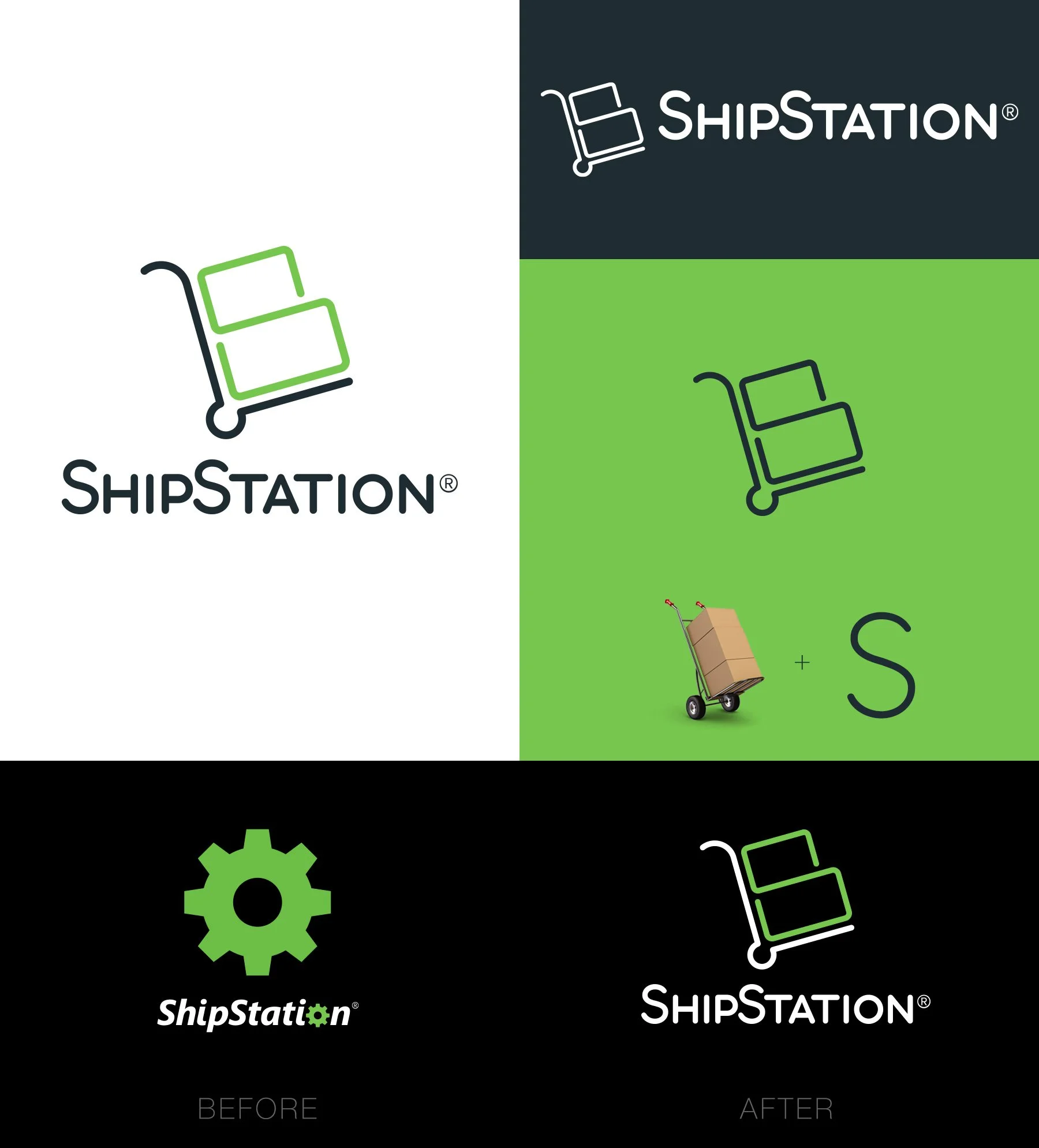
The problem
As a conceptual exploration, I set out to reimagine ShipStation’s brand identity. The existing logo felt dated and overly corporate—out of sync with the company’s innovative, partner-driven ecosystem. It lacked the energy and modern edge you’d expect from a brand powering today’s ecommerce businesses.
The objective
The goal was to create a modernized visual identity that reflected ShipStation’s role as a friendly, fast, and reliable logistics partner. I focused on clean geometry, approachable typography, and a visual rhythm that communicated motion and efficiency—core to how the brand serves its customers.
The result
The redesigned logo feels vibrant and human, capturing the spirit of connection and movement that defines the brand. It’s fresh, youthful, and scalable—equally at home on digital platforms, partner integrations, and physical touchpoints. A modern identity that feels ready to ship.