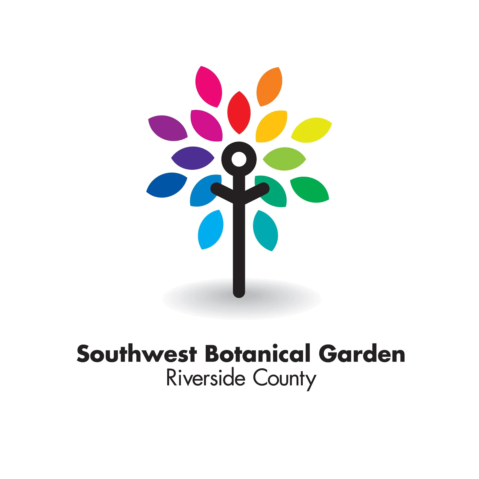
The problem
Southwest Botanical Gardens of Riverside County wanted a fresh, modern identity that could elevate their public presence. As a non-profit, they needed something elegant and timeless that could work across signage, printed materials, and digital channels—without overwhelming the natural beauty of the gardens themselves.
The objective
The goal was to create a sophisticated, minimalist logo that reflected the serenity, diversity, and professionalism of the gardens. I wanted the identity to feel calm, refined, and approachable, giving the organization a sense of credibility while remaining warm and inviting to visitors.
The result
The final logo distilled the essence of the gardens into a clean, modern mark that could scale from small print to large signage. The minimalist approach allowed the beauty of the botanical subjects to shine while giving the organization a cohesive, professional identity. This pro bono project provided a serene counterpoint to my usual bold, high-energy branding work, demonstrating versatility in my design approach.