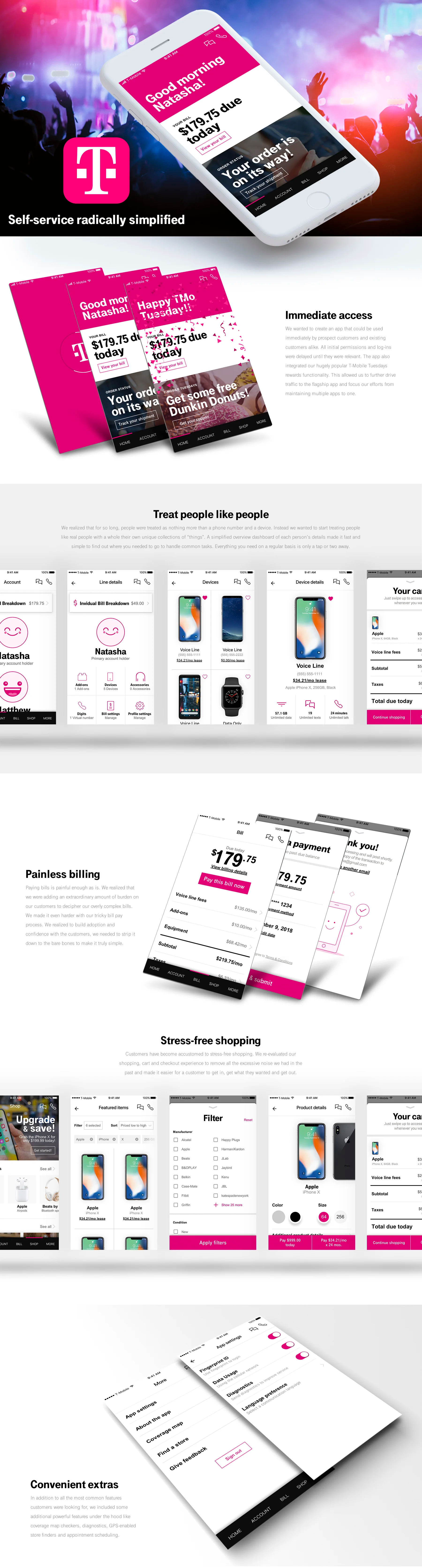
The problem
As Senior UX Design Manager, I was tasked with rethinking the flagship T‑Mobile app from the ground up. The existing app and website were riddled with friction—confusing onboarding, opaque billing flows, and a complex rate plan structure—slowing users down and limiting satisfaction across T‑Mobile’s 119.7 million U.S. customers.
The objective
The goal was to radically simplify the app experience, making it fast, intuitive, and accessible for all users. Guided by research insights, we focused on removing friction at every step—from first access and sign-in to daily tasks like billing, shopping, and rewards. We aimed to deliver intelligent, relevant content, streamline account management, and reimagine rate plans and transactions to reduce confusion, all while integrating key features like the TMO Tuesdays rewards program and messaging with the Team of Experts.
The result
The outcome was a cohesive, simplified experience that unified learnings from multiple areas into a single north-star vision. The MVP successfully launched with a subset of these enhancements, delivering a faster, more intuitive app. Future iterations are planned to roll out additional capabilities, building on the foundation of clarity, convenience, and customer-focused design.